

Been thinking about colour.
Initially, I thought that the colours the boy can see is abnormal colours. Then, coincidently, i just looked through my old foundation works, randomly. I saw these 2 paintings.
The idea is using cold or warm colours to get the opposit mood of the image. This all about how u treat the conposition (shape, proportion, colour percentage).
cold colours for warm mood

warm colours for cold mood
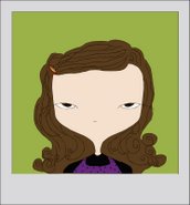
Here are some samples i found using warm colours for cold / uncomfortable moods.


New idea: for the jelly land, a surrounding environment, an aerial shot. How to cut the shot?
No comments:
Post a Comment